
Blog / Trading
Technical analysis from first principles: a beginner's complete guide
A thousand patterns have a thousand names — and every one of them is a footnote to a single tug-of-war between buyers and sellers. Candlesticks, chart patterns, support and resistance, moving averages, Bollinger Bands, MACD, and multi-time-frame analysis, explained from the ground up.
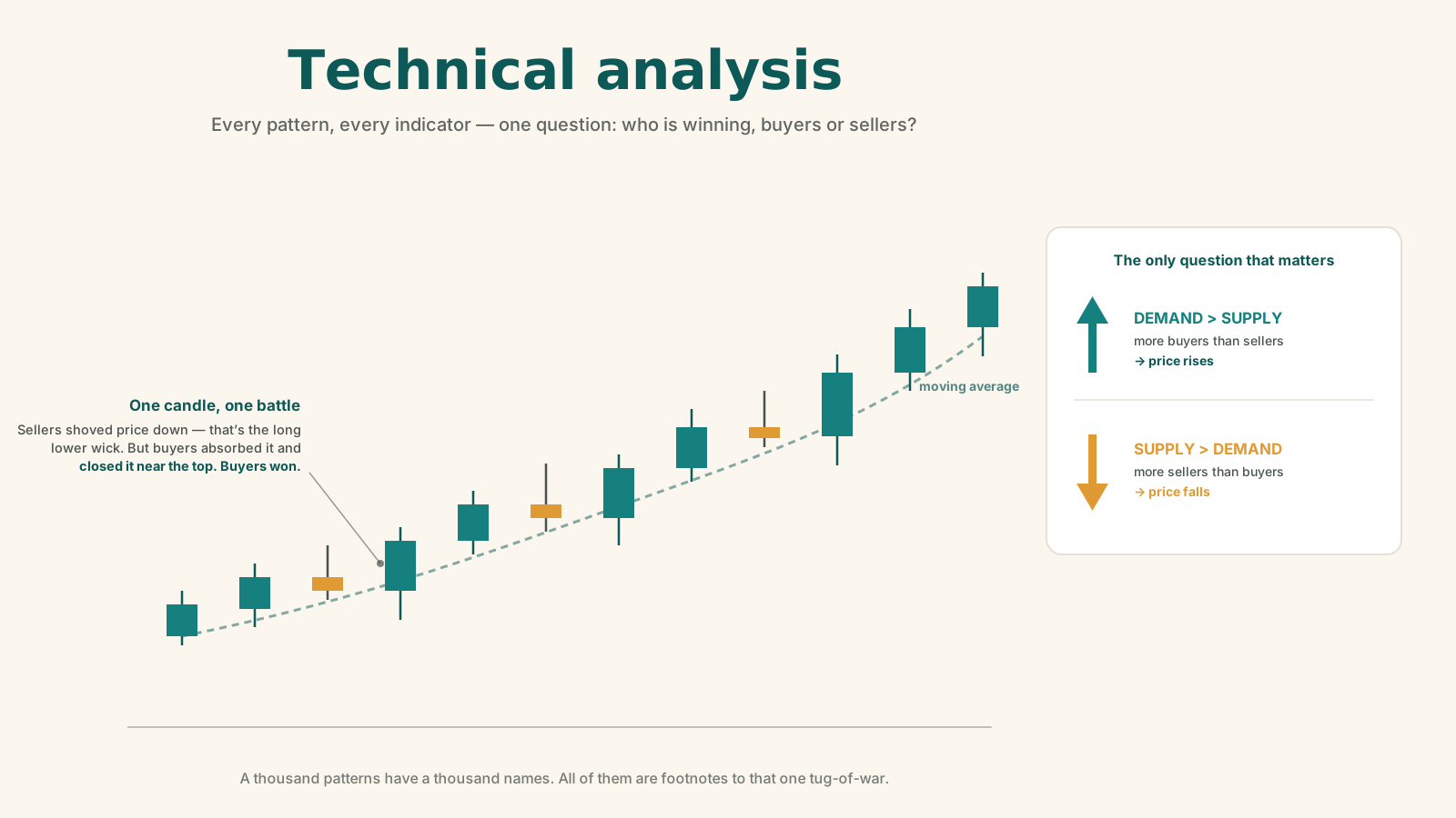
Open any chart for the first time and you get the same reaction everyone gets: a wall of squiggles, coloured bars, and acronyms, none of which tell you what to actually do.
This guide fixes that — not by handing you a list of patterns to memorise, but by starting where every serious chart reader starts: with one idea that everything else hangs off. Get that idea, and the thousand names stop being intimidating and start being obvious.
A note on what this is. This is education about how traders read charts, not financial advice and not a recommendation to trade. The Ant Fund's usual beat is patient, long-horizon index investing — technical analysis is a different discipline with a different risk profile, and most people building long-term wealth never need it. It's worth understanding on its own terms; it is not worth betting your retirement on. Specific tickers and prices below are illustrative teaching examples from the session this is drawn from, frozen at that moment in time — never a pick.
First, some honesty about scale
If trading were a four-year degree, technical analysis alone would take a year. And it would still only be one subject on the transcript. The others:
- Macroeconomics — what rates, inflation, and policy are doing.
- Fundamental analysis — what a business is actually worth.
- Risk management and position sizing — how much to bet, and how to not die.
- Trading psychology and trading biases — the part that beats most people.
Charts alone don't make you a trader. Knowing that up front is the first useful thing this guide can give you. What follows covers roughly five topics — candlestick patterns, chart patterns, support and resistance, moving averages (plus Bollinger Bands), and MACD — then multi-time-frame analysis, and a long practical Q&A.
1. The one principle: supply and demand
Everything in technical analysis reduces to a single idea.
- More sellers than buyers (supply exceeds demand) → price falls. Bearish.
- More buyers than sellers (demand exceeds supply) → price rises. Bullish.
That's it. Every pattern, every indicator, every piece of jargon you'll ever meet — and there are "probably a thousand names for a thousand patterns" — is just a different lens on this one tug-of-war.
So don't get lost memorising names. If you can always answer "who is winning right now, buyers or sellers?" you already hold the fundamental building block of trading. Everything below is just increasingly refined ways of asking that same question.
2. Candlesticks
Anatomy: the four prices (OHLC)
A candlestick is a visual summary of price action over one period — a day, an hour, a week. Each candle encodes four numbers, known as OHLC:
| Component | Meaning |
|---|---|
| O — Open | The price at which the period started |
| H — High | The highest price reached during the period |
| L — Low | The lowest price reached during the period |
| C — Close | The price at which the period ended |
Structurally, a candle has just two parts:
- The body — the rectangular part, spanning the open and the close.
- The wick (also called the shadow) — the thin lines above and/or below the body, marking the high and low that price touched but could not hold.
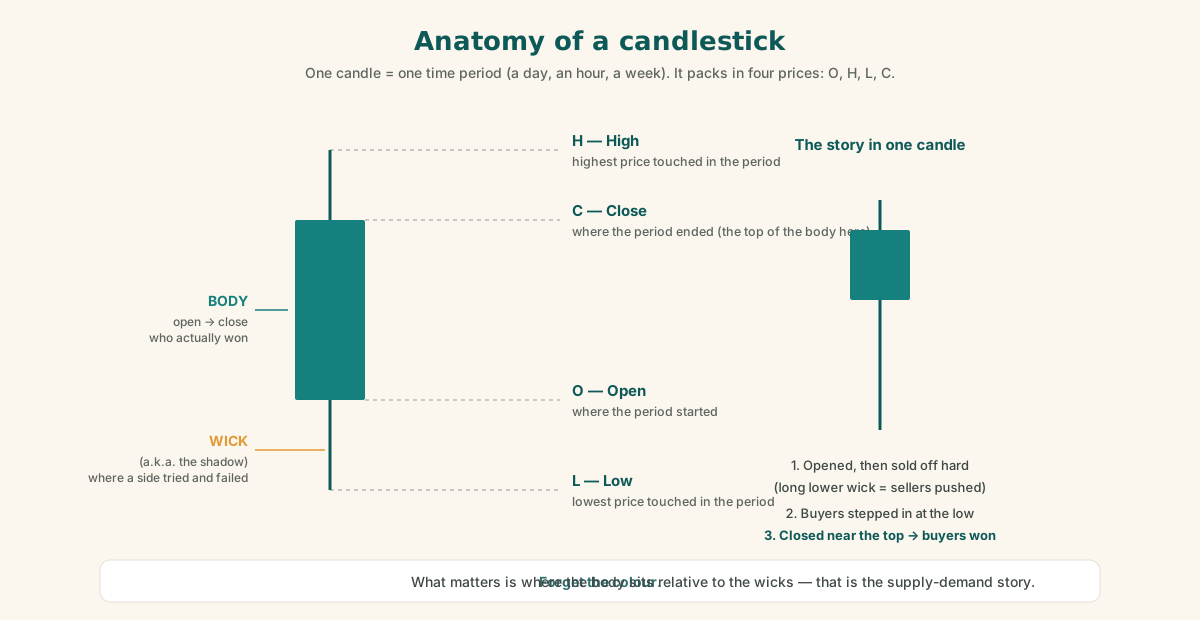
Read a candle as a story. Suppose a candle opens, sells off sharply (sellers everywhere, no buyers), and then buyers step in at the low and shove price back up to close near the top. That entire battle is captured in one candle: a long lower wick with the body near the top. The wick shows where one side tried and failed. The body shows who actually won by the close.
Forget the colour
This is worth stressing because beginners fixate on it: the colour of the candle (green vs. red) is not the point. What matters is where the body sits relative to the wicks — where the open is, where the close is, and what happened in between. That structure is the supply-demand story. The colour is just a convention laid on top of it.
Three categories are all you need
There are dozens of named candlestick patterns — doji, hammer, inverted hammer, shooting star, hanging man, and on and on. Full "cheat sheets" are free online, and studying them all could take ten hours by itself.
But every candlestick collapses into three categories:
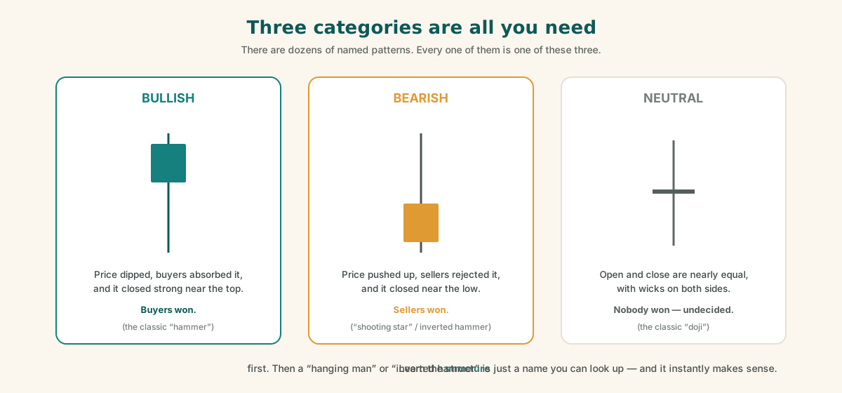
- Bullish — price dipped (long lower wick) and closed strong near the top. Buyers absorbed the selling and won. (The classic hammer.)
- Bearish — the mirror image: price pushed up, sellers rejected it, and it closed near the low — a long upper wick with the body at the bottom. (The shooting star / inverted hammer.)
- Neutral — open and close are nearly the same, with wicks on both sides. Neither side won; the market is undecided. (The doji.)
The takeaway: don't learn names first. Learn supply and demand, learn where the open and close sit, learn what happened intraday — and then the named patterns become obvious. When someone says "hanging man," you look it up once and it instantly makes sense, because you already understand what the structure means.
3. Chart patterns
If candlesticks are individual bricks, chart patterns are the shapes those bricks form collectively over time. A candlestick pattern is one candle (or a small cluster); a chart pattern is the larger formation built from many.
The naming zoo is just as large here — pennants, flags, wedges, cup-and-handle, ascending triangles, descending triangles, V-bottoms, channels, rectangles. And once again, the names are secondary. The question underneath every one of them is the same: is supply beating demand, or demand beating supply?
The worked example: an ascending triangle
The S&P 500 (via SPY, the S&P 500 ETF) provided a live example of an ascending triangle:
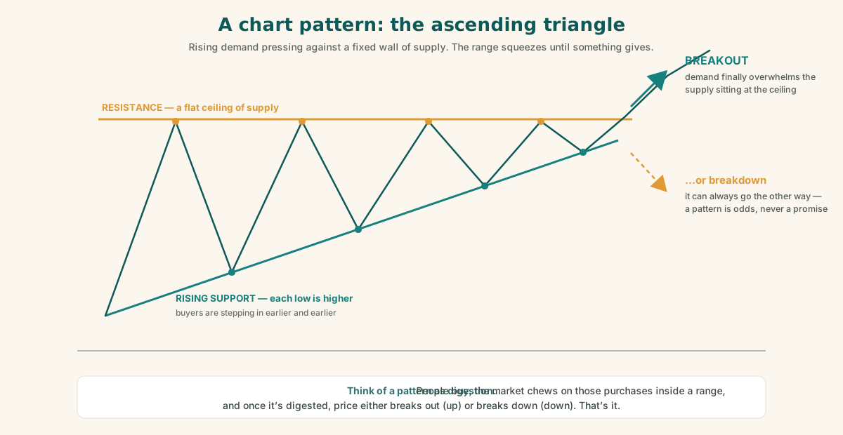
- Price repeatedly rises to a flat overhead level (resistance) and gets pushed back.
- But each pullback bottoms at a higher low — buyers are stepping in earlier and earlier.
- The pattern compresses: price oscillates in a narrowing range against that flat ceiling.
- Eventually there's a good chance it breaks out above the ceiling — though it can also break down.
The higher lows tell you demand is steadily increasing. The flat top tells you supply is sitting at a known price. When demand finally overwhelms that supply, the breakout happens.
Patterns as "digestion"
A useful mental model: a chart pattern is a digestion phase. People buy, the market digests those purchases (consolidating between support and resistance), and once it's digested, price either breaks out (up) or breaks down (down).
That's genuinely all it is.
4. Support and resistance
The core mechanic
- Resistance — a price level where rallies keep getting rejected. The psychology: as price approaches, holders think "this is a good price, I'll take profits" — and they sell. That selling caps the advance.
- Support — the mirror image below: a level where buyers repeatedly step in and halt declines.
The cycle at resistance goes: price bangs into the level → profit-taking pushes it down → greed pulls buyers back in → price returns to the level → more profit-taking. After enough rounds, one of two things happens:
- More buyers than sellers → price breaks out above resistance.
- More sellers than buyers → price breaks down below support.
That is all support and resistance is: supply and demand concentrated at specific price levels.
Horizontal lines vs. trend lines
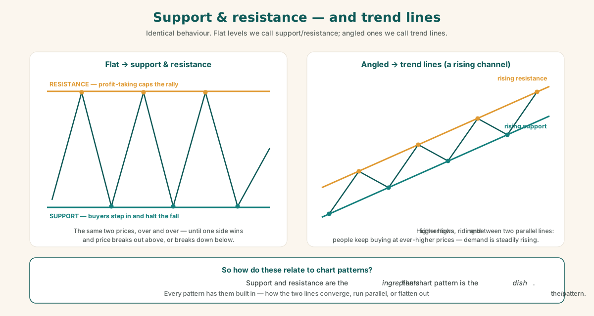
- If the levels are horizontal, we call them support and resistance.
- If the same behaviour happens along an angled line — price making steadily higher lows, or lower highs — those are trend lines.
Angled, parallel support/resistance lines get named channels, rectangles, pennants, flags… and again, the names don't matter. An upward-sloping channel simply means people are steadily willing to buy at higher and higher prices (constantly rising demand) — or steadily raising the price at which they take profits.
So what's the difference between support/resistance and a chart pattern?
This came up as a question, and the answer is about relationship, not opposition:
Chart patterns have support and resistance built into them.
The support line and the resistance line are the components. The way they combine and interact — converging, running parallel, a flat top with a rising bottom — is the pattern. Support and resistance are the ingredients; the chart pattern is the dish. Reading a pattern means reading how those levels are evolving.
A word on jargon: "price action"
Don't be intimidated by the vocabulary. "Price action" just means how the price is moving. Technical analysis is full of overlapping terms, and different people use different names for identical behaviour. Anchor yourself in supply and demand, and the jargon stops being confusing.
5. Moving averages
What one is
A moving average smooths price by averaging the closing prices over a lookback window.
(A convention worth knowing: when traders say "price" with no qualifier, they almost always mean the closing price. All four OHLC values matter, but the close is what averages are built from.)
A 50-day moving average is just the average of the last 50 daily closes, recalculated — "moving" — each day.
Simple vs. exponential
- Simple Moving Average (SMA) — every day in the window is weighted equally. This is the right starting point.
- Exponential Moving Average (EMA) — recent days are weighted more heavily, making it more reactive to recent price.
Why do EMAs exist? Traders adopted them while hunting for an edge — a slight advantage over other participants. Trying variations like this is how traders search for edges. But it isn't necessary for the fundamentals. Start simple.
Why 20 / 50 / 200?
The three to focus on are the 20-day, 50-day, and 200-day. The reasons are wonderfully unglamorous:
- In the pre-computer, pre-calculator era, traders computed averages by hand or in their heads. Round numbers were essential — an average is a sum divided by a count, and dividing by 20 is far easier than dividing by 21.
- 20 ≈ one trading month. There are about 21 trading days in a month; 20 is the nearest easy number.
- 50, 100, 200 just continue the pattern of round, easy numbers.
- Some traders use 21-day, 9-day, or 26-day averages as a personal niche. That's fine — but 20 / 50 / 200 is all you need to remember.
How to read them
The simplest signal framework in existence:
- Price above the 50-day → bullish. Price below the 50-day → bearish.
- The 50-day represents the short-to-medium-term trend. The 200-day represents the long-term trend.
- The classic long-term investor's rule: stay invested while price is above the 200-day; exit when it drops below. A large share of long-term market participants genuinely do exactly this.
The 200-day in real market history
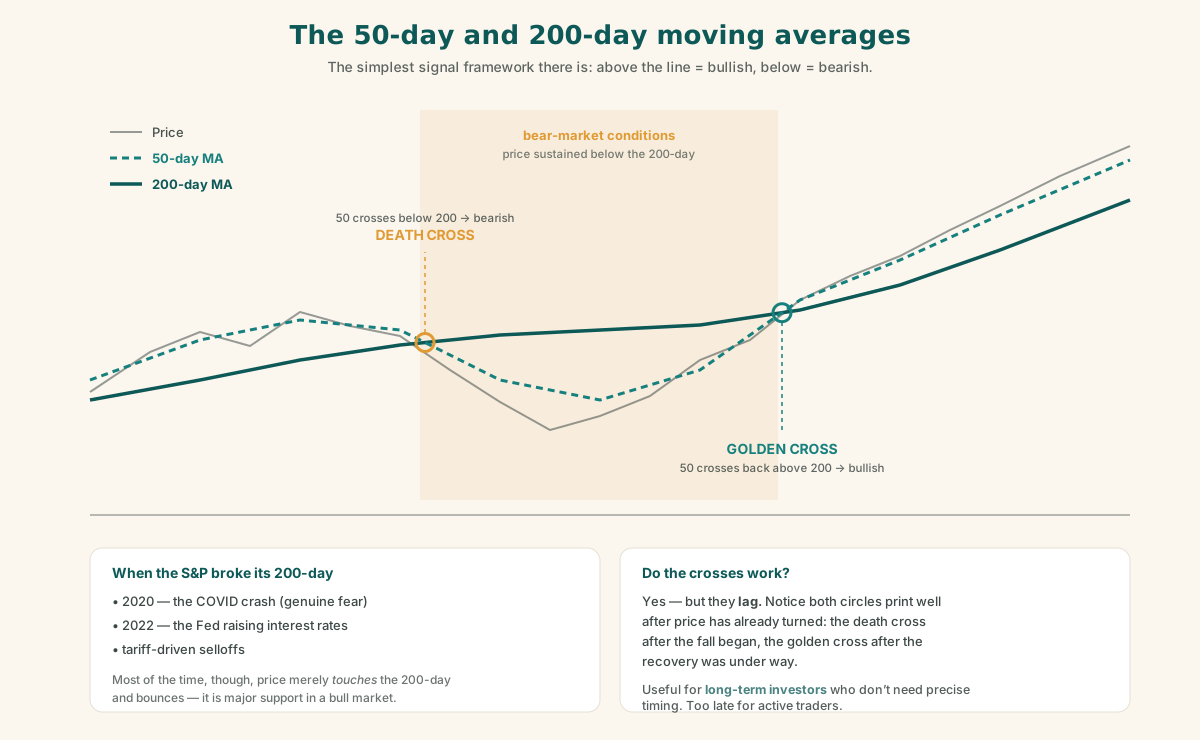
Look at the S&P 500's history and the breakdowns below the 200-day line up neatly with the genuine fear events:
- The COVID crash (2020) — a violent breakdown, when people were truly scared.
- The 2022 lows — driven by the Fed raising interest rates.
- Tariff-driven selloffs — another macro-fear breakdown.
The pattern to remember: a sustained break below the 200-day usually means bear-market conditions. But equally important — and this is the part people forget — most of the time price merely touches the 200-day and bounces. In an ongoing bull market it acts as major support.
Golden cross and death cross
Two famous crossover signals:
- Golden cross — the 50-day crosses above the 200-day → bullish.
- Death cross — the 50-day crosses below the 200-day → bearish.
Do they work? Yes — but they lag. By the time the cross actually prints, much of the move has already happened: the damage on the way down, or the initial rally on the way up. For an active trader, "they're too late." They're most useful for long-term investors who don't need precise timing.
The multi-time-frame twist: the crossover concept isn't restricted to daily charts. A day trader can watch a 50-period vs. 200-period cross on an hourly or minute chart — same logic, faster clock. Even then, for true day trading, 50/200 crosses are still late; shorter pairs like 5/10 or 10/20 periods are more responsive. This is exactly why different traders end up using different lengths — they're tuning the same concept to their own time horizon.
6. Bollinger Bands
What they are
Bollinger Bands (from John Bollinger, who wrote the definitive book on them) are a volatility-based envelope around price, with three components:
- A 20-day moving average (the middle line),
- An upper band, and
- A lower band.
The bands sit a set number of standard deviations above and below the 20-day average — which is why they widen and narrow with volatility.
Because the 20-day MA is already built in, you never need to plot a separate 20-day MA on your chart.
How to read them
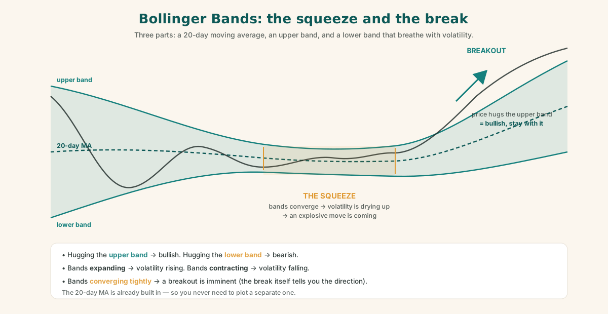
- Price hugging the upper band → bullish. Even bounces along the upper region stay bullish.
- Price hugging the lower band → bearish.
- Bands expanding → volatility is increasing.
- Bands contracting → volatility is decreasing.
- Bands converging / squeezing tightly → a breakout is imminent. Whenever the channels pinch together, expect an explosive move soon — with the break itself confirming the direction.
Bollinger Bands effectively give you a dynamic, self-adjusting form of support and resistance — an upper and lower limit that adapt to current volatility.
Why they suit a breakout trader
They were the presenter's favourite indicator — and the reason is personality fit. As a momentum swing trader / breakout trader, the squeeze-then-breakout behaviour is exactly the setup he pounces on. That pairing of indicator to personality is itself one of the lessons of this whole guide.
The complete upper-chart setup
The entire recommended overlay on the price chart is just three things:
- 50-day moving average
- 200-day moving average
- Bollinger Bands (which include the 20-day MA)
Nothing else. Complex charts don't make better traders. These three, understood deeply, are enough.
7. MACD — the only lower-panel indicator you need
The indicator zoo
Below the price chart live the oscillators: RSI, Stochastic, Volume, ADX, ATR, and dozens more. Experimenting with them is encouraged — "I keep trying different things" — but the goal is to find your favourite: the one whose behaviour you understand so intimately that it becomes intuitive.
For the presenter, that's MACD. With MACD alone he can largely infer what price action is doing — not just divergence, but momentum and strength too.
The complete chart, top and bottom: Bollinger Bands + 50-day MA + 200-day MA on the price panel, MACD below. Nothing else.
What MACD actually means
MACD = Moving Average Convergence Divergence. The name is the concept. It measures what the gap between a faster and a slower moving average is doing:
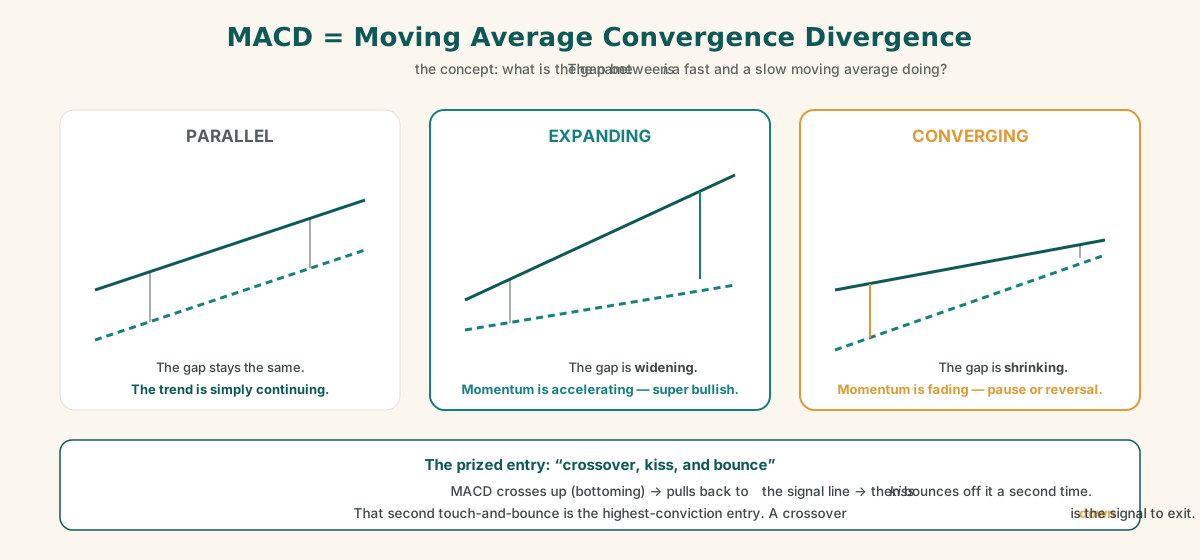
- Parallel → the trend is simply continuing steadily.
- Expanding / diverging (the gap is widening) → momentum is accelerating — super bullish in an uptrend. As long as the distance between the averages keeps growing, the move is powerful.
- Converging (the gap is shrinking) → momentum is fading. This warns of either a consolidation (a pause) or an outright reversal.
Positive and negative divergence
Divergence is when the indicator and the price disagree — and it's MACD's most powerful signal.
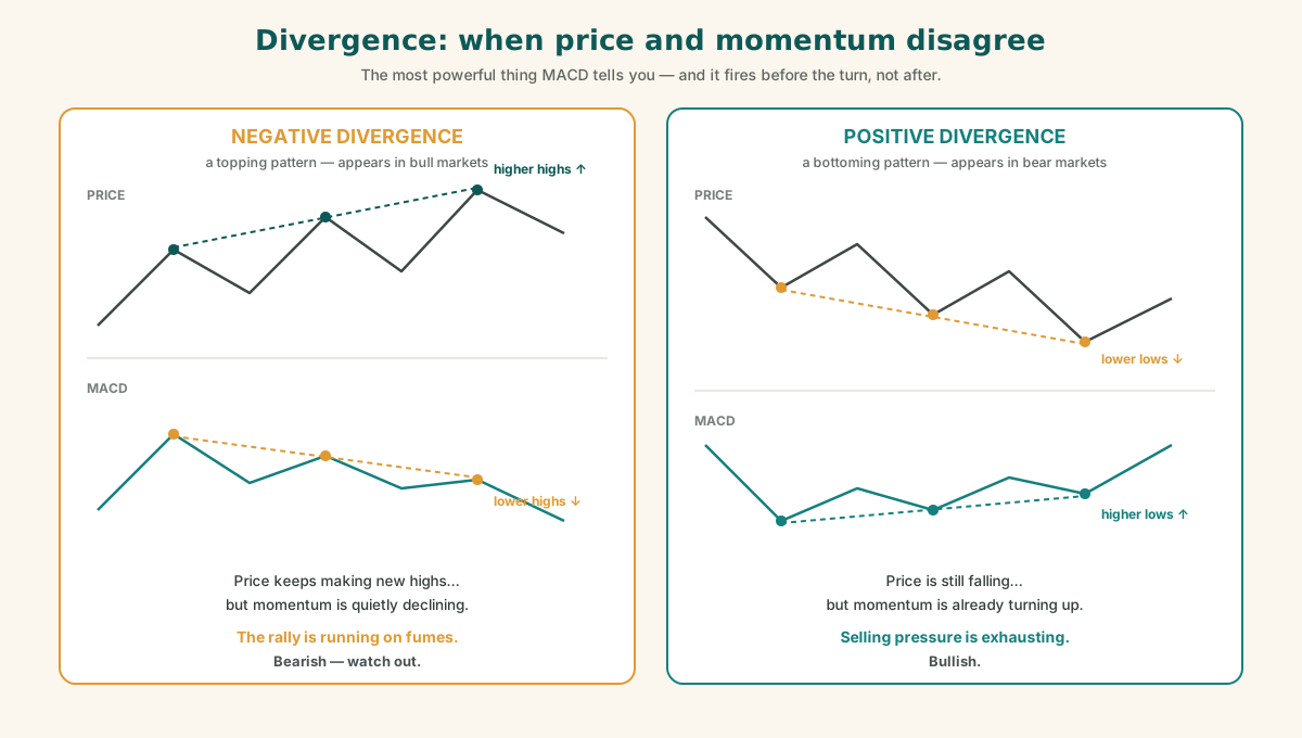
- Negative divergence — price is still making new highs, but MACD momentum is declining. The rally is running on fumes. Bearish — watch out. Negative divergences show up in bull markets and act as a topping pattern.
- Positive divergence — price is still falling, but MACD makes a higher low. Selling pressure is exhausting. Bullish. Positive divergences show up in bear markets and act as a bottoming pattern.
The practical MACD playbook
- Continuation: MACD trending up and staying up → super bullish, stay in.
- Crossover down: the signal to exit. "I will exit right here" — at the crossover.
- The favourite entry — "crossover, kiss, and bounce": MACD crosses up (bottoming), pulls back to kiss the signal line, then bounces off it a second time. That second touch-and-bounce is the highest-conviction entry — a confirmed bottoming pattern.
- A small-candle bounce with a mild kiss-and-bounce is still valid, but only a short-term signal — not a tremendously bullish one. Especially on fast timeframes (5–10 minute charts), where multiple crossovers, fake breakouts, false breakdowns, and chop are common.
And the critical caveat, delivered with that answer:
"If you follow this — someone else's exact style — you will be losing money. You can make money as long as you follow your own style."
Favourite patterns have to become your favourites — internalised until you can pull the trigger without hesitation.
8. Multi-time-frame analysis
Described as the concept that "changed the whole wiring of my mind on technical analysis."
The method: always top-down
Everything above works identically on any timeframe — monthly, weekly, daily, hourly, 5-minute, 1-minute. Multi-time-frame analysis means deliberately combining them, always top-down:
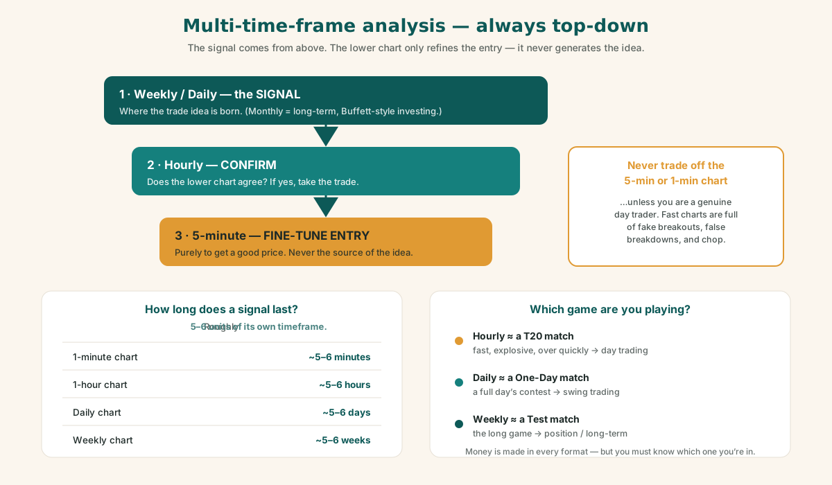
- The signal comes from the higher timeframe — for a swing trader, the weekly or daily. (Monthly is for long-term, Warren Buffett–style investors.)
- Once the daily/weekly gives a signal, drill down to the hourly for confirmation.
- If the hourly confirms, take the signal and initiate the trade.
- Before actually entering, glance at the 5-minute chart — purely to fine-tune a good entry price. Never as the source of the trade idea.
- Never trade off the 5-minute or 1-minute chart itself — unless you are a genuine day trader.
The signal-duration rule of thumb
How long does a signal last? Roughly five to six units of its own timeframe:
| Signal timeframe | Expected duration of the move |
|---|---|
| 1-minute chart | ~5–6 minutes |
| 1-hour chart | ~5–6 hours |
| Daily chart | ~5–6 days |
| Weekly chart | ~5–6 weeks |
This is exactly why the timeframe you analyse must match the timeframe you intend to hold.
The cricket analogy
- Hourly chart ≈ a T20 match — fast, explosive, decided quickly. (Day trading.)
- Daily chart ≈ a One-Day match — a full day's contest. (Swing trading.)
- Weekly chart ≈ a Test match — the long game. (Position / long-term trading.)
If you want to be good at the weekly game, study weekly charts. If you play the hourly game, you're a day trader. Money can be made in every format — buy-and-hold, swing trading, day trading — but you must know which game you're playing.
Timeframes by trader type
- Tick charts (every single trade — sub-second granularity, originally encountered in Forex) and 1-minute / 5-minute charts → serious day traders. They live intraday and will never look at a daily chart for their signals.
- Trend traders → daily, hourly, and weekly.
- Swing traders → the same daily/hourly/weekly combination, held for days to weeks.
9. Know your trading personality
A theme running through everything: your edge starts with self-knowledge.
The presenter's self-description, as a worked example:
- A momentum swing trader and breakout trader — when a breakout fires, he pounces and rides the momentum.
- Not a day trader. Not a long-term buy-and-hold investor.
- Not a contrarian — he will not buy while everything is falling. That's somebody else's game.
- Holds positions for one to six months.
The corollaries matter more than the specifics:
- Your indicators should match your personality. Bollinger squeezes suit a breakout trader. They might not suit you.
- Day trading requires very quick reflexes and the ability to change your mind instantly. If that isn't you, day trading isn't for you — the fake breakouts and chop will eat you alive.
- Bulls make money, bears make money — but pigs get slaughtered. A bull stays invested while the market is good and exits when it turns. A bear stays out of bull markets and gets invested when things turn. Both make money. It's the undecided — the ones who won't commit to a view — who get chopped to pieces. Indecision is what kills.
- Still, listen to the other side. Michael Burry repeatedly calling an AI bubble isn't something to follow blindly — but it's healthy to hear what the bears are saying.
10. The session's market outlook
Offered as the presenter's stated view — and flagged here as his opinion, not a forecast and not our position: we are likely in one of the greatest bull markets in history, comparable to the 1960s–1990s era in which the legends — Warren Buffett, Stanley Druckenmiller, George Soros — built their fortunes. The MACD and moving-average expansion on the long-term charts supported staying invested: "Market is still good. Don't worry. Invest."
With the standing rule attached: stay in only as long as the market remains above its key moving averages — and exit when it turns.
11. The Q&A — where the real lessons live
Bias first, instrument second
"Using the 50/200-day MAs, is it better to buy stocks or do options?" — Both. But the reframing is the point:
- Moving averages and crossovers exist to form a bias: bullish or bearish.
- Stocks, long calls, short puts, cash-secured puts — these are all just instruments for expressing that bias.
- Bullish? You can buy the stock, buy calls (in-, at-, or out-of-the-money), or sell cash-secured puts. The choice depends on your risk and reward appetite — not on the chart.
- The presenter's own specialty is cash-secured puts, typically in-the-money, though he buys stock at times too. (If that's unfamiliar, our guide to calls and puts and the Wheel cover exactly these instruments.)
Don't focus on the instrument. Form the bias with technicals, then pick the instrument that fits your risk profile.
Do technicals actually work? (And is there a Holy Grail?)
"Are these technicals really followed by the market 100% of the time?"
- There are 100 indicators and 100 experts. Institutions constantly change their models. The example: the Renaissance / Medallion fund of Jim Simons — arguably the smartest operation in trading — runs on the order of 100–150 models, rotating and updating them constantly. The market is always evolving; no single indicator works forever.
- But here's the liberating truth: your setup does not need to work 100% of the time. If it works more than 50% of the time, you make good money. At 56–60%+, you make tremendous money. It's the casino principle — a win probability slightly above 50%, applied repeatedly with discipline, compounds into profit.
- 100% is impossible. There is no Holy Grail — not even for institutions. Realistic ceilings are maybe 60%, 65%, 70%.
- And remember what you're up against: markets have attracted some of the smartest people in the world for centuries. PhDs plus algorithms are already in the game. Respect that. Don't expect to out-magic it — expect to out-discipline it.
False breakouts, manipulation, and algos
"There are manipulations and fake breakouts by market makers — how far can we trust technicals?"
False breakouts are real and common. A worked example (WDC): price broke below the 50-day MA — which "should" be bearish — and then immediately reversed. That was a false breakdown, designed to shake out weak hands.
The mechanism: everyone's stop-losses cluster around the obvious levels. Is support at 98.90? 98.97? 98.75? Nobody knows exactly, and it keeps shifting. Algorithms deliberately push price through those levels to flush the stop-losses, then let price resume. This is very common, it has intensified over the last ~15 years as algos got smarter, and it will probably get worse.
But here's the structural protection: moving a market takes enormous money. The US stock market is roughly $40–50 trillion — about 37–40% of the entire world's stock market value. Manipulating big moves in mega-caps takes billions upon billions. So manipulation is real, but bounded: it can shake levels; it cannot fake a sustained trend in the largest names.
The PDT rule and retail day trading
- PDT = the Pattern Day Trading rule — the $25,000 minimum account requirement for frequent day trading.
- The view: not a big deal either way. Retail traders can only really move small tickers — GameStop, meme stocks, small names with thin volume. Apple, Tesla, and the Mag 7 cannot be moved by retail flows.
- The practical advice is blunt: even if you have $25,000+ and can day trade freely, you probably shouldn't. It's too dangerous. If anything, take less risk than the rules allow — because the one truly unforgivable outcome is blowing up your account.
Risk-reward: the worked example
A live illustration of how to evaluate a position (Applied Digital, around $31 at the time):
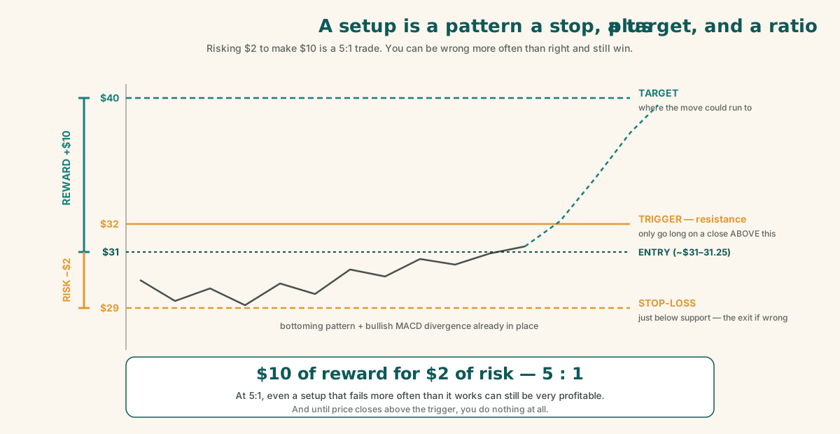
- Entry around $31–31.25, with a stop-loss just below support at ~$29 → risk ≈ $2 per share.
- Upside target: a ride toward $40 → reward ≈ $10 per share.
- $10 of reward for $2 of risk — a 5:1 ratio. "I'll take it any day."
- The chart context: a bottoming pattern with a bullish MACD divergence already in place. The trigger: a close above $32, clearing resistance. Only then does he go long.
The lesson: a great setup is not just a pattern. It's a pattern plus a defined stop, plus a defined target, plus a ratio that makes the trade worth taking even if it fails often. At 5:1, you can be wrong most of the time and still come out well ahead.
Reading live charts: a bounce is not a breakout
Asked for live examples, the walkthrough demonstrated the whole method end-to-end. (Again: teaching examples, frozen in time — not picks.)
- CoreWeave (CRWV): Start on the weekly chart — top-down, always. Bollinger Bands and the 50-day MA showed a young chart (recently listed). Price was trying to bounce and MACD was still constructive — but the move was a bounce within a downtrend, running straight into overhead resistance. It was not a breakout and not a confirmed bottom. Verdict: not long yet. Wait for the curve-up and the resistance break.
- Nebius (NBIS): On the daily, it was just about to break its level — if it closes above resistance, enter. It looked stronger than CoreWeave, though it too had the 50-day MA looming overhead as resistance. Verdict: closer — but still not yet.
The shape of that analysis is the lesson: higher timeframe first → distinguish a bounce from a breakout → locate the resistance → define the exact trigger price → and then do nothing at all until the trigger fires.
A swing trader's morning routine
"When you start trading in the morning, how do you know which stock to trade?"
The decision is never made at the open. As a swing trader holding for 1–6 months, the positions and the watchlist already exist. "I have already planned it. We are on 24×7."
- The routine: the day starts around 8:00 AM with news. By 8:25–8:30 the screens are open and ready. 8:30–9:30 is protected trading time — no meetings, no interruptions (meetings start at 9:30).
- Pre-market process: review the existing tickers — which are making money, which are losing. Check the charts: did something change? Why is this one working? If a position is super bullish, add to it. Scan the top movers and losers within the watchlist.
- Never randomly pick stocks from the whole market. "I'm beyond that." No Jim Cramer picks, no CNBC tips. By the time a ticker shows up on CNBC, it's too late — that's the time to exit.
- Sector focus and rotation: trade only 3–4 sectors you know deeply — in his case chips/semiconductors, software, fintech, and energy. Explicitly avoided: pharma, biotech, crypto stocks. "I know my strengths." When you know nearly every ticker in your chosen sectors and read about them constantly, the chart doesn't even have to tell you what to watch.
- Information sources: technical news feeds, Finviz, semiconductor news, Seeking Alpha — specialised channels, not television.
- Planned execution, start to finish: waiting on a name (SK Hynix) for weeks → entering the stock on the planned trigger → then converting the stock position into options once options became available days later. Every step known in advance.
Where to learn more
"Can you recommend courses or resources?"
There are plenty of free PDFs and dozens of books on chart and candlestick patterns; Udemy and similar platforms have courses. "You can spend money, or you can spend time" — both paths work, because the fundamental blocks are the same everywhere.
But the order matters. Learn concept-first. Don't start by memorising hanging-man / hammer / inverted-hammer / doji flashcards — you'll just get confused. Understand supply and demand first. Then, when you meet a named pattern, you look it up once and it slots instantly into a foundation you already have.
12. What this guide deliberately leaves out
This was an introduction, and it stops well short of a complete trading education. The pieces still missing — and they are not optional extras:
- Risk management
- Position sizing
- Trading psychology (and trading biases)
Charts tell you what might happen. These three decide whether you survive being wrong — which, given that even a great trader is wrong 35–40% of the time, is the part that actually determines the outcome.
Summary
Technical analysis looks like a thousand disconnected rules. It isn't. It's one question — who is winning, buyers or sellers? — asked at progressively finer resolution:
- A candlestick asks it over one period.
- A chart pattern asks it over many periods.
- Support and resistance ask it at specific price levels.
- Moving averages ask it about the trend.
- Bollinger Bands ask it about volatility.
- MACD asks it about momentum.
- Multi-time-frame analysis asks it at the scale you actually intend to trade.
And then risk-reward, discipline, and self-knowledge decide whether knowing the answer is worth anything.
Key takeaways
- Everything is supply vs. demand. More buyers → up; more sellers → down. Every pattern name is a footnote to this. Learn the concept, not the flashcards.
- Candlesticks encode OHLC. The body and wick structure — never the colour — tells the story. All patterns reduce to bullish / bearish / neutral.
- Chart patterns are digestion. They always contain support and resistance (horizontal) or trend lines (angled). Consolidation resolves into a breakout or a breakdown.
- Keep the chart simple: 50-day MA + 200-day MA + Bollinger Bands on top, MACD below. Nothing else. Complex charts don't make better traders.
- Above the 200-day = bull market; a sustained break below = bear market (COVID, 2022 rate hikes, tariffs). Most touches just bounce. Golden and death crosses work but lag — they're for long-term investors, not traders.
- A Bollinger squeeze means a breakout is coming. Hugging the upper band is bullish; the lower band, bearish.
- MACD is momentum: expanding = accelerating, converging = fading. Negative divergence tops bull markets; positive divergence bottoms bear markets. "Crossover, kiss, and bounce" is the prized entry; a crossover down is the exit.
- Analyse the timeframe you intend to hold. Signals last roughly 5–6 units of their own timeframe. Signal from above, confirm on the hourly, fine-tune on the 5-minute — never the reverse.
- There is no Holy Grail. A >50–60% win rate with good risk-reward (like 5:1) and discipline is all it takes. Even the smartest fund in the world rotates 100+ models constantly.
- Expect false breakouts and algo stop-hunts. They're real and getting worse — but manipulation is bounded; nobody fakes a sustained trend in a mega-cap.
- Know yourself. Pick the game, the sectors, the indicators, and the instruments that fit your personality and risk appetite. Copying someone else's style is how you lose money. Bulls make money, bears make money — pigs get slaughtered.
- Protect the account above all. The one unforgivable outcome is blowing up.
Disclaimer
This article is educational content about how technical analysis works. It is not financial, investment, or trading advice, and nothing in it is a recommendation to buy or sell any security. All tickers, prices, levels, and setups mentioned are illustrative teaching examples captured at a moment in time — they are not picks and will be stale by the time you read this. Trading involves a real and substantial risk of loss, and most active traders underperform a simple index fund. Please consider speaking to a qualified financial professional before risking capital.
Related reading
The bucket strategy for retirement: a simple guide with a $1.5M example
Keep a few years of expenses in safe, boring investments and the rest in stock index funds — so a market crash never forces you to sell at the bottom to pay your bills. Explained with a $1.5M, $5,000/month worked example.
Your FIRE number: every major method, calculated and compared
There's one equation underneath every FIRE calculator. The whole debate is about how to set one number in it. A field guide to seven methods — Bengen's 4% rule, Morningstar's forward-looking SWR, CAPE-linked rates, Guyton-Klinger guardrails, dynamic withdrawals, and the variants (Lean, Fat, Coast, Barista) — plus the architecture that combines them.
Will my money last? A beginner's guide to the Monte Carlo retirement calculator
What a Monte Carlo retirement calculator actually is, how it works under the hood, and how to read every number it gives you — explained in plain English.