
Blog / Retirement
Will my money last? A beginner's guide to the Monte Carlo retirement calculator
What a Monte Carlo retirement calculator actually is, how it works under the hood, and how to read every number it gives you — explained in plain English.
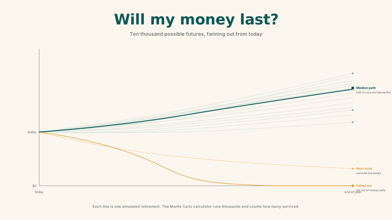
There's one question that sits underneath every retirement plan: will my money last as long as I do?
Most simple retirement calculators answer it with a comforting lie. They assume your investments grow at one steady rate — say 7% — every single year, forever. Punch in your savings, your spending, and your timeline, and they draw a smooth line into the future.
The problem is that markets don't move in smooth lines. Some years are up 25%, some are down 15%, and — this is the part that matters most — the order those years arrive in can make or break your retirement. A Monte Carlo retirement calculator is built specifically to capture that messiness.
This guide explains what it is, how it works under the hood, and how to read every number it gives you. No finance degree required.
A note on what this is. This is education about how a planning tool works, not financial advice. Your situation is unique — consider talking to a qualified financial professional before making big retirement decisions.
What "Monte Carlo" actually means
The name comes from the famous casino city, and the idea behind it is exactly what you'd guess: randomness and probability.
Instead of assuming your portfolio earns one fixed return every year, a Monte Carlo simulation rolls the dice thousands of times. Each "roll" plays your entire retirement forward from start to finish using a different, randomly generated sequence of market returns. Then it asks a simple question at the end of each run: did the money last, or did it run out?
Do that 1,000 or 10,000 times, count up the results, and you get something far more honest than a single straight line: a range of possible futures and the odds of each one.
Think of it like a weather forecast. A forecaster doesn't promise it will rain tomorrow — they say there's a 70% chance. A Monte Carlo calculator does the same thing for your money: it gives you a probability, not a promise.
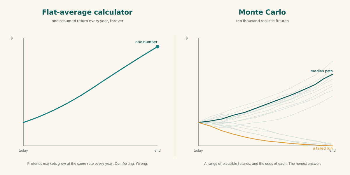
The picture above is the entire pitch. A flat-average calculator gives you the line on the left. Monte Carlo gives you the fan on the right — and the fan is the only one that's honest about how markets actually behave.
How it actually works, step by step
You don't need to do any of this math yourself — the calculator handles it — but understanding the mechanics helps you trust (and question) the output.
Step 1 — You provide the inputs.
The calculator needs a handful of numbers about your situation:
- How much you have saved today
- How much you'll add each year (until you retire)
- How much you plan to spend each year in retirement
- How many years the plan needs to cover (your time horizon)
- Your portfolio's expected return (the long-run average it's likely to earn)
- Your portfolio's volatility (how much returns bounce around year to year)
- Optionally: inflation, taxes, and other income like a pension or Social Security
Step 2 — It runs one full "lifetime."
For each year of your retirement, the calculator randomly draws a return — not the flat average, but a realistic number pulled from a distribution. One year it might draw +18%, the next −9%, the next +4%. It applies that return to your balance, subtracts your spending, adjusts for inflation, and moves to the next year. It repeats this until it reaches the end of your time horizon. That's one simulation.
Step 3 — It does that thousands of times.
Now it throws away that first run and does the whole thing again with a brand-new random sequence of returns. And again. And again — usually 1,000 to 10,000 times. Each run is a different possible version of your future. In one, a crash hits the year after you retire. In another, you enjoy a roaring first decade. In another, returns are boringly average.
Step 4 — It tallies the results.
Once every simulation has finished, the calculator counts how many ended with money still in the account versus how many ran dry. If 850 out of 1,000 runs survived, your success rate is 85%. It also records the ending balance of every single run so it can show you the full spread of outcomes.
The one concept that makes Monte Carlo worth it: sequence-of-returns risk
If you remember nothing else from this post, remember this.
Imagine two people who retire with the same savings and experience the exact same average return over 30 years. You'd think they'd end up in the same place. They don't.
- Person A hits a brutal market crash in years 1–3 of retirement — right when they're pulling money out to live on. They're selling investments at low prices to cover expenses, which permanently shrinks the pot. Even when the market recovers, there's less money left to recover with. Person A can go broke.
- Person B experiences that same crash in years 27–29 — near the end, after decades of growth have already done their work. Person B sails through and dies with money to spare.
Same average return. Wildly different outcomes. The difference is purely the order the good and bad years arrived in.
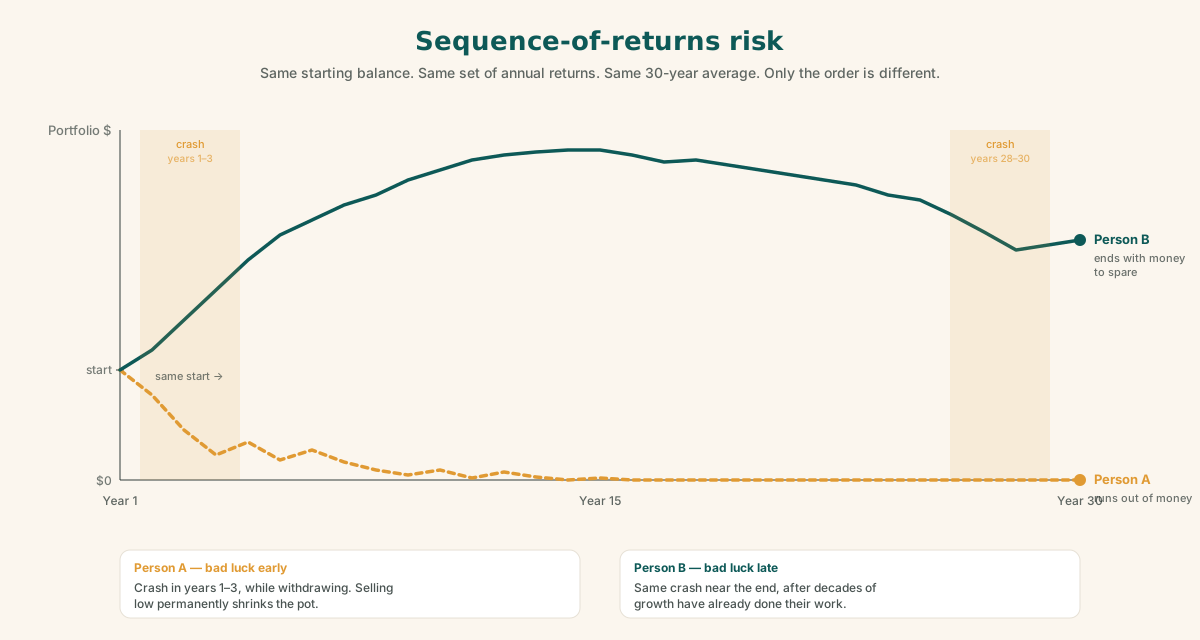
This is called sequence-of-returns risk, and a flat-average calculator is completely blind to it. Monte Carlo is built to expose it — because by shuffling the order of returns across thousands of runs, it naturally tests the unlucky-early-crash scenarios alongside the lucky ones. The ugly ones show up in the failure count. They have to be planned for.
How to read the output
A Monte Carlo calculator usually reports five things. They sound technical, but they're all just different ways of describing the same pile of results: the ending balance of every simulation.
First, a quick definition. The word "terminal" simply means at the end of the simulation — the dollar amount left in the account when your time horizon runs out. Every simulation produces one terminal value. The metrics below summarize all of them.
1. Success rate — the headline number
The percentage of simulations where you never ran out of money before the end. An 85% success rate means 850 of 1,000 runs made it to the finish line with money still in the account.
How to interpret it as a rough guide:
| Success rate | What it suggests |
|---|---|
| 90%+ | A comfortable, robust plan |
| 75–90% | Workable, but worth monitoring and adjusting |
| Below ~70% | A warning — change something (spend less, save more, work longer, or take less risk) |
One important nuance: nobody should aim for 100%. A 100% success rate usually means you're being so cautious that you'll die with a huge unspent pile of money — money that could have funded a better, fuller life. A great plan balances safety with actually enjoying what you've saved.
2. Median terminal value — the typical outcome
Line up all 1,000 ending balances from smallest to largest and take the one exactly in the middle. Half the simulations ended richer, half ended poorer. This is your "typical" result.
Why median and not average? Because a handful of wildly lucky runs (think a once-in-a-generation bull market) can drag the average way up and paint a rosier picture than reality. The median ignores those extremes and tells you what a normal outcome actually looks like.
If a calculator shows you an average instead of a median, be skeptical — it's quietly flattering your plan.
3. The 10th percentile — your pessimistic case
Only 10% of simulations ended worse than this number. Think of it as "if things go badly — but not catastrophically, roughly a 1-in-10 bad scenario — this is where I land."
This is the number conservative planners watch most closely, because it stress-tests the plan. If your 10th percentile still leaves you solvent and comfortable, your plan is sturdy even when markets are unkind.
4. The 90th percentile — your optimistic case
The mirror image: only 10% of simulations ended better. This is "if markets are generous to me." It's useful for seeing your upside potential — but never plan around it. Building a retirement that only works in the 90th-percentile world is just betting on luck.
5. Distribution of terminal portfolio values — the whole picture
This is usually a histogram, and it's where all the other numbers live. It shows how many simulations ended at each balance level. Every metric above is just a landmark on this one chart:
- A spike of bars sitting at or near zero = the failed runs (these are what your success rate counts).
- A hump in the middle where most outcomes cluster = the median lives near here.
- A long tail stretching to the right = the lucky runs that grew very large.
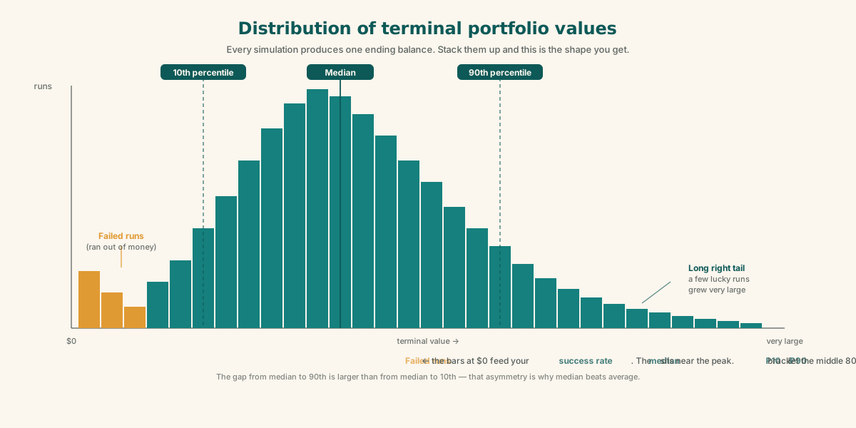
That long right tail is the key thing to notice. It's asymmetric — the distance from the median up to the 90th percentile is much larger than the distance from the median down to the 10th. That lopsidedness is exactly why median beats average, and why a single "expected" number can mislead you.
Putting the five together
Here's a practical reading order when you look at your own results:
- Success rate — your quick pass/fail gut check.
- 10th percentile — judge your downside. Can you survive the unlucky scenarios?
- Median — your realistic expectation for what you'll likely have or leave behind.
- 90th percentile — pure upside. Nice if it happens; never depend on it.
- The gap between 10th and 90th — this is information too. A very wide gap means your outcome is highly sensitive to luck (often a sign of too much stock risk or too high a withdrawal rate). A narrow gap means a more predictable, lower-variance plan.
A trap to avoid: "winning" the wrong way
Here's something that surprises a lot of first-timers. A sky-high success rate paired with a huge median terminal value is not automatically the best outcome.
It often means you're underspending — on track to die with millions unspent, having lived more frugally than you ever needed to. The healthiest-looking result is usually a solid success rate (say 85–95%) with a modest median terminal value. That combination means you've calibrated your spending to actually enjoy your money, while still keeping your odds comfortably high.
Retirement planning isn't only about not running out. It's about not over-saving at the expense of the life you wanted to live.
The limits of Monte Carlo (read this before you trust it)
A Monte Carlo calculator is a powerful tool, but it's a model — not a crystal ball. Keep three honest caveats in mind.
Garbage in, garbage out. The output is only as good as your assumptions. Optimistic return assumptions or unrealistically low spending will inflate your success rate artificially. Be conservative and realistic with your inputs, and try a few different sets to see how sensitive the result is.
Standard Monte Carlo can understate real-world risk. The basic version draws each year's return independently and randomly, as if the market has no memory. Real markets aren't quite like that — they have momentum, mean reversion, and occasional fat-tailed crashes that are bigger and clumpier than a simple random model predicts. More advanced calculators address this by bootstrapping (drawing from actual historical return sequences) instead of assuming a tidy bell curve.
It's a steering wheel, not a verdict. The single best way to use the tool isn't to obsess over one success-rate number. It's to change one input at a time and watch how the number moves. Retiring two years later, trimming spending by 10%, or shifting your stock/bond mix will each nudge that percentage. Seeing which lever moves it most tells you exactly where your plan is fragile — and that insight is worth far more than the headline figure.
The bottom line
A Monte Carlo retirement calculator trades a single false certainty for an honest range of possibilities. Instead of "your money will grow at 7% and last 35 years," it tells you "across thousands of possible futures, your plan succeeds 85% of the time, your typical ending balance is X, and even in a bad-luck scenario you still land at Y."
That's a much more useful thing to know. Read the success rate for the headline, the 10th percentile for your downside, the median for your realistic expectation, and the distribution to see the whole shape of what might happen. Then start turning the dials — because the real value of the tool is showing you how to make a fragile plan a sturdy one.
Key takeaways
- Flat-average calculators lie by omission. Real returns aren't a smooth 7% every year, and the order of good and bad years matters enormously.
- Sequence-of-returns risk is the killer. Two people with the same average return can have wildly different outcomes depending on when the crashes hit. Monte Carlo is the only common tool that surfaces this.
- The five numbers all describe the same pile of terminal values. Success rate (% that survived), median (typical), 10th percentile (bad case), 90th percentile (good case), and the distribution that holds them all.
- Prefer median over average. A few jackpot runs can inflate the average. Median tells you what a normal outcome looks like.
- The 10th percentile is the most important number for stress-testing your plan. If your downside scenario is still livable, your plan is sturdy.
- Don't aim for 100% success. That usually means you're under-spending. A healthy plan sits around 85–95% with a modest median terminal value — odds high enough to be safe, low enough that you actually enjoy your savings.
- Use the calculator as a steering wheel. Don't fixate on the headline number — move one lever at a time (retirement age, spending, stock allocation) and watch how the success rate responds. The biggest lever is where your plan is most fragile.
- It's a model, not a forecast. Inputs drive everything. Be conservative, run multiple scenarios, and remember that real markets have fatter tails and more momentum than a tidy random model captures.
Ready to run your own numbers? Open the Monte Carlo retirement calculator → — it runs entirely in your browser, so your inputs never leave your device. Try the default scenario first, then change one input at a time and watch what happens to the success rate.
Related reading
The bucket strategy for retirement: a simple guide with a $1.5M example
Keep a few years of expenses in safe, boring investments and the rest in stock index funds — so a market crash never forces you to sell at the bottom to pay your bills. Explained with a $1.5M, $5,000/month worked example.
Technical analysis from first principles: a beginner's complete guide
A thousand patterns have a thousand names — and every one of them is a footnote to a single tug-of-war between buyers and sellers. Candlesticks, chart patterns, support and resistance, moving averages, Bollinger Bands, MACD, and multi-time-frame analysis, explained from the ground up.
Your FIRE number: every major method, calculated and compared
There's one equation underneath every FIRE calculator. The whole debate is about how to set one number in it. A field guide to seven methods — Bengen's 4% rule, Morningstar's forward-looking SWR, CAPE-linked rates, Guyton-Klinger guardrails, dynamic withdrawals, and the variants (Lean, Fat, Coast, Barista) — plus the architecture that combines them.